
Exploring Slack Navigation and User Interface Design Principles
Disclaimer: This post is for educational and informational purposes only and does not provide financial advice or investment guidance.
Introduction
User interface design plays a critical role in how effectively people interact with digital platforms. In the context of team collaboration tools used in the United States, slack offers a useful case study for understanding how navigation, layout, and visual hierarchy support daily communication tasks. This post provides an informational overview of slack’s interface structure, explaining how users move through the platform and how design decisions influence usability.
The Purpose of Interface Structure
Digital platforms with multiple functions must present information in a clear and predictable way. Slack’s interface is designed to reduce cognitive load by dividing the workspace into consistent visual zones. Each section of the screen has a defined purpose, allowing users to understand where to look for conversations, tools, and settings.
From an educational perspective, this demonstrates a common design principle: when navigation remains stable, users can focus on content rather than mechanics.
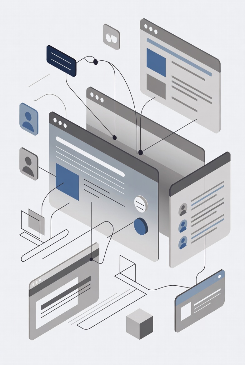
Sidebar Navigation and Content Grouping
The left-hand sidebar is a central navigation element in slack. It typically contains a list of channels, direct conversations, and system-level sections. This layout prioritizes access to communication spaces while keeping secondary tools out of the main view.
Channels are grouped vertically, reinforcing the idea that each conversation belongs to a specific topic. Collapsible sections help manage longer lists, showing how interface design adapts to both small and large workspaces.
This approach reflects a broader trend in software design where navigation elements remain persistent, allowing quick transitions without disrupting workflow.
Central Workspace and Message Display
The central area of the interface is dedicated to content. When a channel or conversation is selected, messages appear in a continuous vertical stream. Visual spacing, timestamps, and user identifiers are used to distinguish individual entries without overwhelming the viewer.
Slack also uses subtle visual indicators, such as separators and alignment, to help users follow conversation flow. Threaded replies are visually offset, making it clear when a discussion branches from the main topic.
These design choices illustrate how hierarchy and spacing contribute to readability in text-heavy environments.
Top Bar Functions and Global Access
At the top of the interface, slack includes a global navigation bar. This area typically provides access to search, notifications, and workspace settings. Placing these tools in a consistent location ensures they are available regardless of which channel is active.
Search functionality is particularly important from an educational standpoint. It transforms the platform into a navigable archive rather than a transient chat tool. The interface supports filtering and keyword-based discovery, showing how navigation extends beyond simple menus.
Visual Consistency and Accessibility
Visual consistency is another defining characteristic of slack’s interface. Fonts, icons, and color accents are applied uniformly across the platform. This reduces confusion and supports accessibility for users with varying levels of technical experience.
Contrast, spacing, and icon clarity also contribute to usability. These elements are not unique to slack but represent widely accepted interface standards used across digital collaboration platforms.
Understanding these standards helps users recognize familiar patterns when interacting with other tools.
Interface Customization Options
Slack allows limited interface customization, such as adjusting sidebar visibility or notification display preferences. While these options do not alter core navigation, they demonstrate how platforms balance personalization with consistency.
From an educational angle, this highlights an important concept: excessive customization can reduce usability, while thoughtful adjustments can improve comfort without fragmenting the experience.
Comparison With Other Interface Models
Other collaboration platforms may emphasize different navigation models. Some rely on dashboard-style home screens, while others center navigation around documents or scheduled activities. Slack’s interface prioritizes continuous conversation and quick switching between topics.
Comparing these models shows how interface design reflects intended use cases rather than universal best practices. Each approach supports different communication habits and organizational needs.
Conclusion
Slack’s navigation and interface design offer a clear example of how structure, consistency, and visual hierarchy support digital communication. By examining the sidebar layout, central content area, and global navigation elements, users can better understand how interface design influences usability. These insights extend beyond a single platform and contribute to a broader understanding of modern digital workspace design.
Disclaimer: This post is for educational and informational purposes only and does not provide financial advice or investment guidance.

You May Also Like
How Slack Organizes Team Communication and Information Flow
Learning Everyday Slack Usage Through Practical Educational Scenarios